
Reisebank
EXPERIENCING A NEW LEVEL
OF CLARITY, SIMPLICITY AND ACCESSIBILITY.
Challenge
Experiencing the market leader in new ways
Over the years, Reisebank AG has established itself as the market leader for travel money and foreign currencies in Germany and has now become the designated cash expert within the DZ BANK Group and thus the cooperative financial group.
With the gradual expansion of the Reisebank's business segment and offering - beyond travel-related services - the potential for a systematic enhancement and modernization of its appearance became evident - also in order to be able to appeal to demanding target groups in the future, e.g. with a sophisticated range of precious metals.
In the context of these changes, the previous appearance of Reisebank, which had matured over the years, reached its limitations in terms of aesthetics, functionality and content, which is why GABC was mandated with the carefully planned enhancement of Reisebank's brand positioning and design.
Reisebank
Reisebank AG is a Frankfurt-based bank which specializes in foreign notes and coins, precious metals, and travel payments. It is a subsidiary of DZ BANK and part of the cooperative financial group. Reisebank operates roughly 100 branches and more than 300 ATMs at airports, train stations, major bus stations, border crossings, and downtown locations.
Reisebank AG was formed in 1996 when the foreign notes and coins business was spun off from what was then Deutsche Verkehrs-Kredit-Bank (DVB). It was integrated into the cooperative financial group in 2004.
Services
Brand Positioning
Brand Portfolio & Architecture
Logo Development
Corporate Design System & Principles
Guidelines & Templates
Brand Activation & Experience
Service Design
Brand Spaces & Retail Design
Interface Design
Brand Change Strategy
Brand Implementation & Rollout
Partner
.bieker Architekten
Brand Strategy
New expectations for the cash and precious metals experts
An in-depth target group and competition analysis formed the strategic basis for the development of alternative positioning corridors for the future Reisebank. These alternative approaches were reviewed with the company's management in internal brand workshops and then further specified against the backdrop of at times considerable market dynamics, not least due to the COVID-19 epidemic.
The approved and sharpened brand positioning is based on the established brand foundation as a leading provider of travelers' currencies, while at the same time reflecting the broader scope of the Reisebank's offering for new, demanding target groups and their changed communication and mobility requirements.
The brand strategy therefore provides the framework for the following upgrade of the brand appearance in terms of both content and design. This upgrade is not only recognized by the market, but also helps to ensure the long-term establishment of the bank's claim to be the cash and precious metals expert within the DZ BANK Group and thus within the cooperative financial group.
In addition to the new positioning, the formal structure of the Reisebank's various product offerings was also evaluated and organized within the framework of the brand strategy. In the future, these will be operated either as subbrands linked closely to the Reisebank or as more independent endorsed brands, depending on the respective needs and the degree of freedom required.

Brand Design
Focus on clarity and accessibility
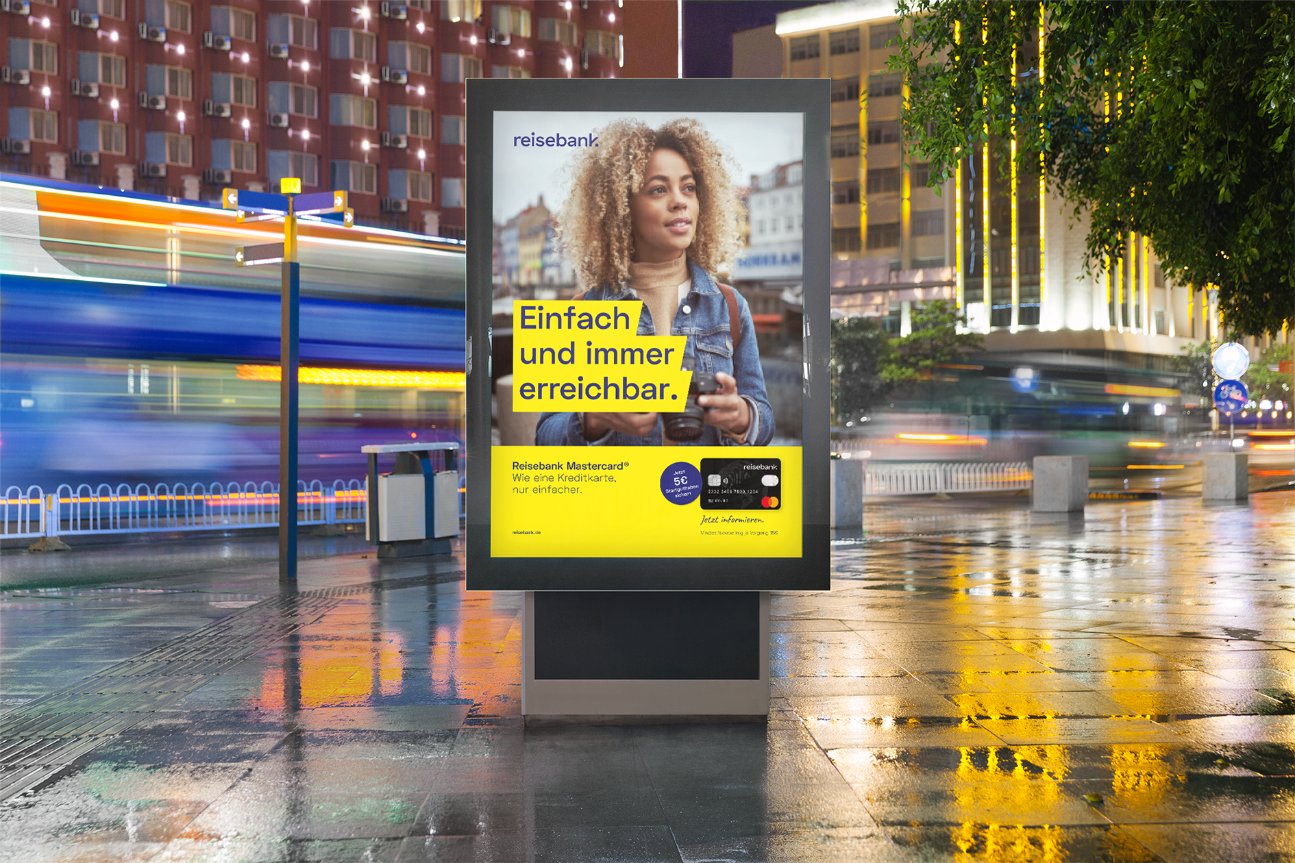
The aim of Reisebank's design evolution was a noticeable, bold modernization of the brand identity, with the aim of making the brand more accessible, more approachable and more likeable.
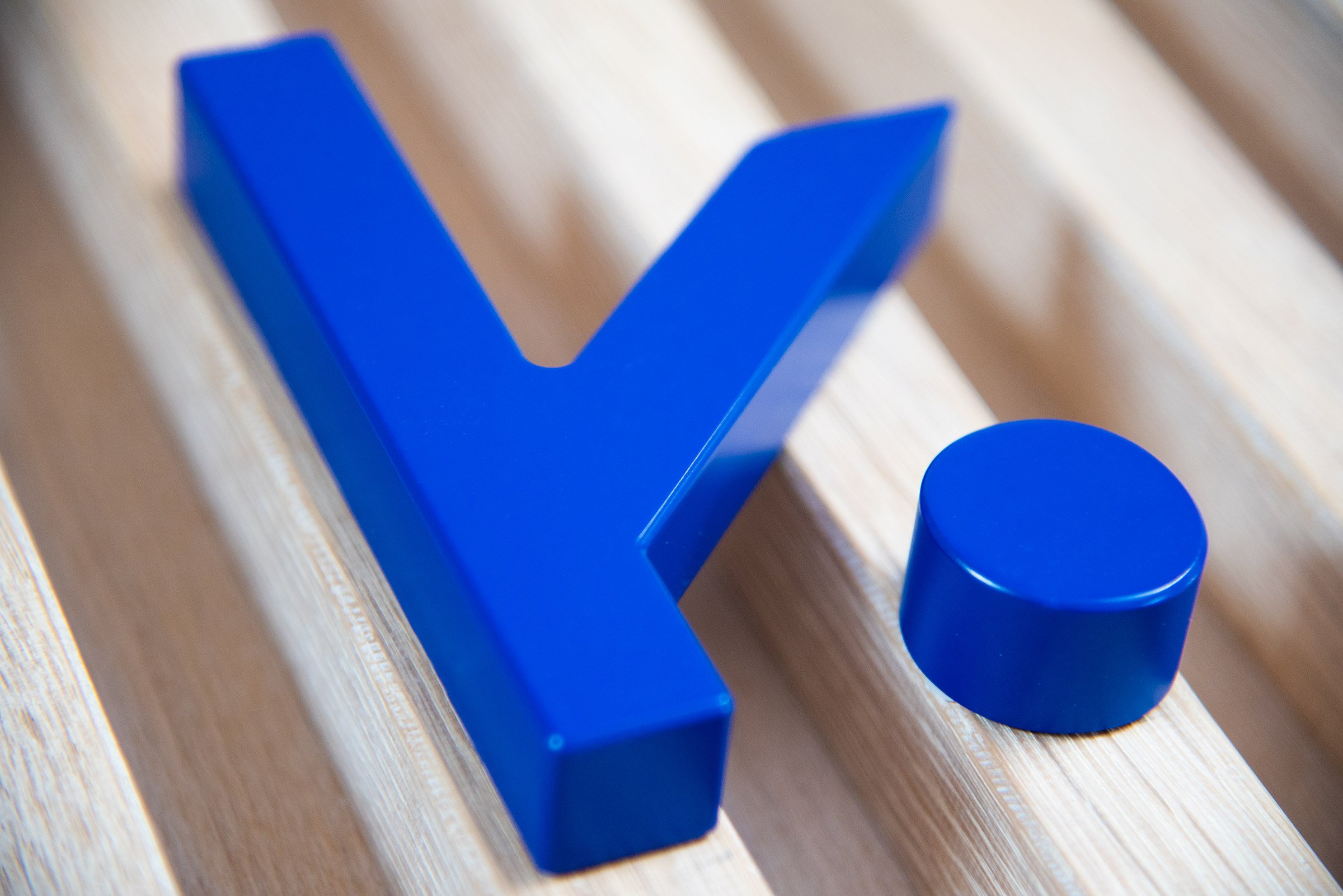
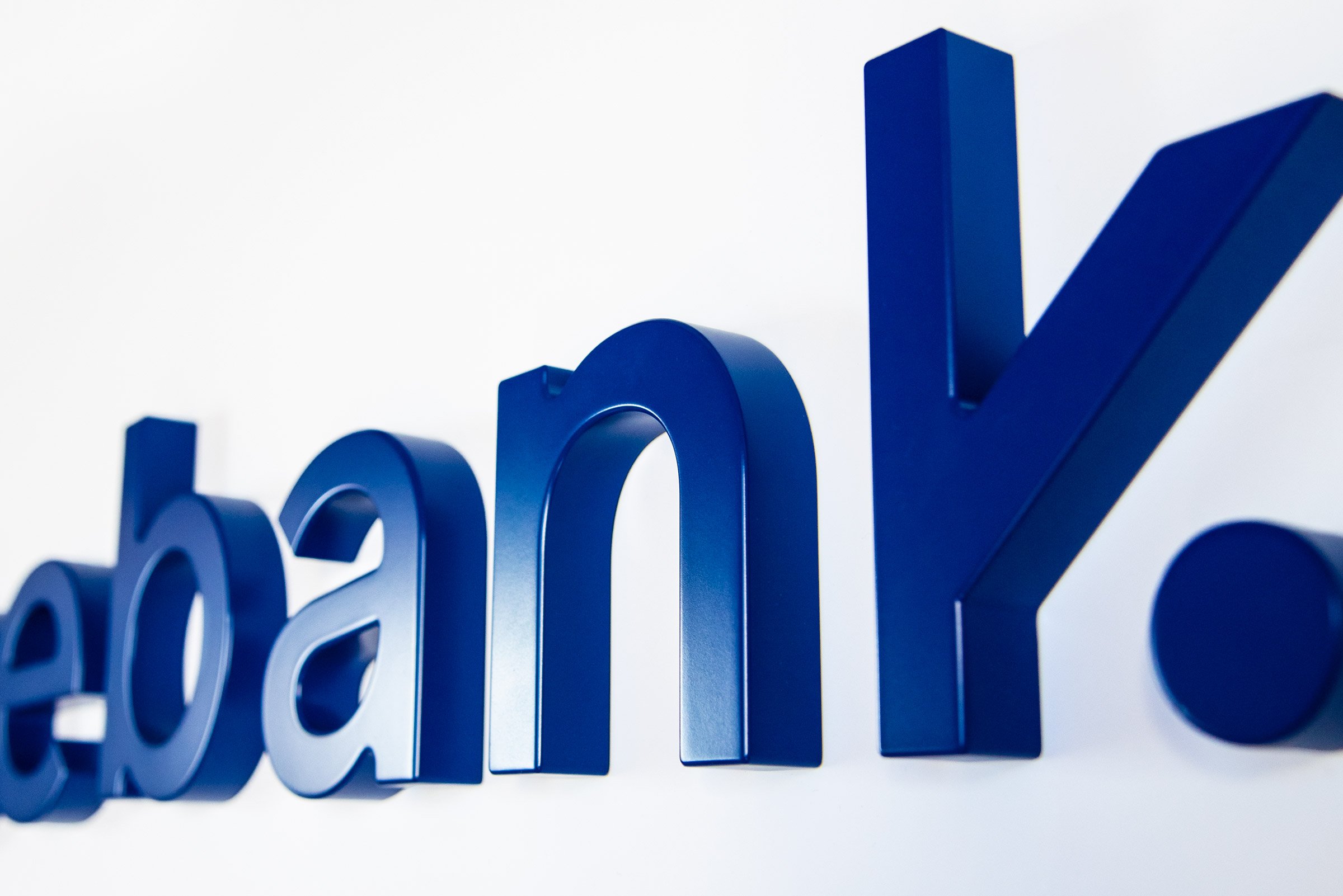
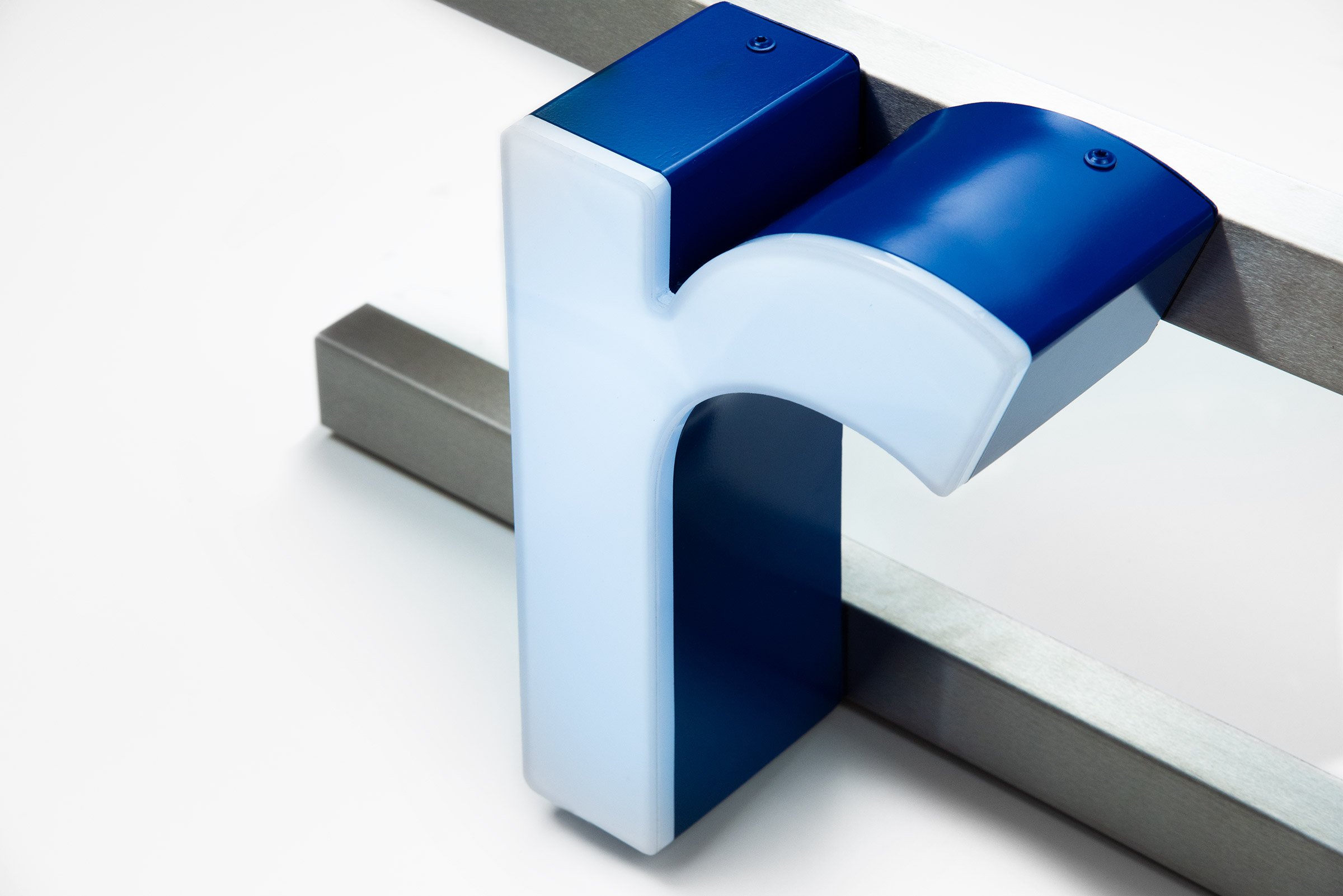
Building on the defining elements such as the 78° angle in the long-standing logo as well as the established color scheme, an evolution of the brand design took place. The new brand appearance is characterized by a few distinct elements: an approachable logo, a precise and recognizable typeface, striking colors and an emotional, unique visual language.
The increased flexibility and modularity of the new corporate design improves usability across all touchpoints. Today, Reisebank customers experience the bank as clear, easy and accessible. Values that also characterize the business relationship with Reisebank. This ambition is also reflected in the defined corporate language, which - where possible - avoids technical vocabulary and is easily understood by all target groups. Accessibility is also underlined by the extensive use of pictograms - in the spirit of cross-lingual, international communication.
"What intrigued us from the start was the unusual tension between the real visibility and expertise of a market-leading bank - but with an attitude untypical of a bank, completely free of status conceit and banking noblesse, due to Reisebank's unique history. This brand DNA deserved an equally clear, approachable brand identity."


Brand Activation & Experience
Maximum flexibility for a holistic customer experience
High accessibility, a clear value proposition and comprehensible, well differentiated product offerings are the focus of the redesign of the reisebank.de website as the brand's central communication platform and online store. Different target groups can find their way around the website easily and intuitively. Exchanging travel money, calculating currencies, buying precious metals, exploring the gold savings plan, experiencing products or simply finding branches - all this is presented and explained in a striking and comprehensible way with just a few clicks.
The website is the starting point for a broad digital brand experience - from digital touchpoints (such as the digital branch guide) to newly designed apps for the brand.
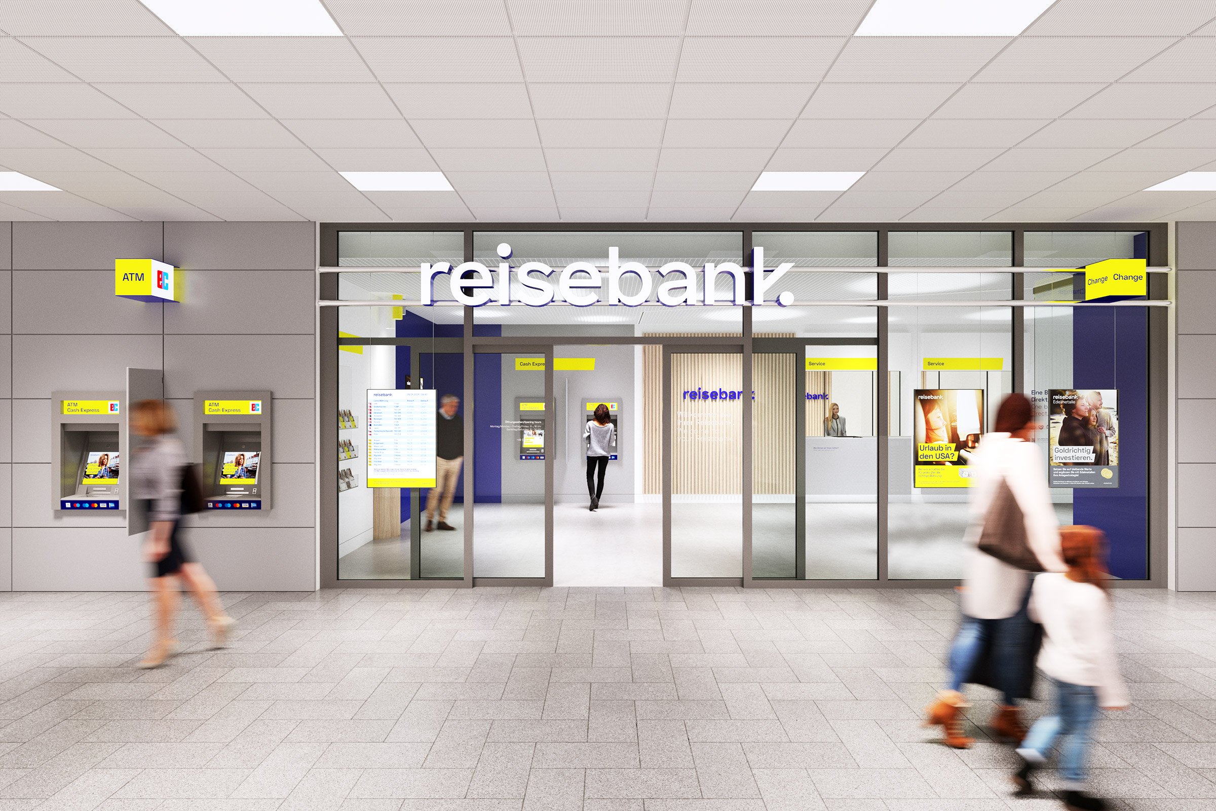
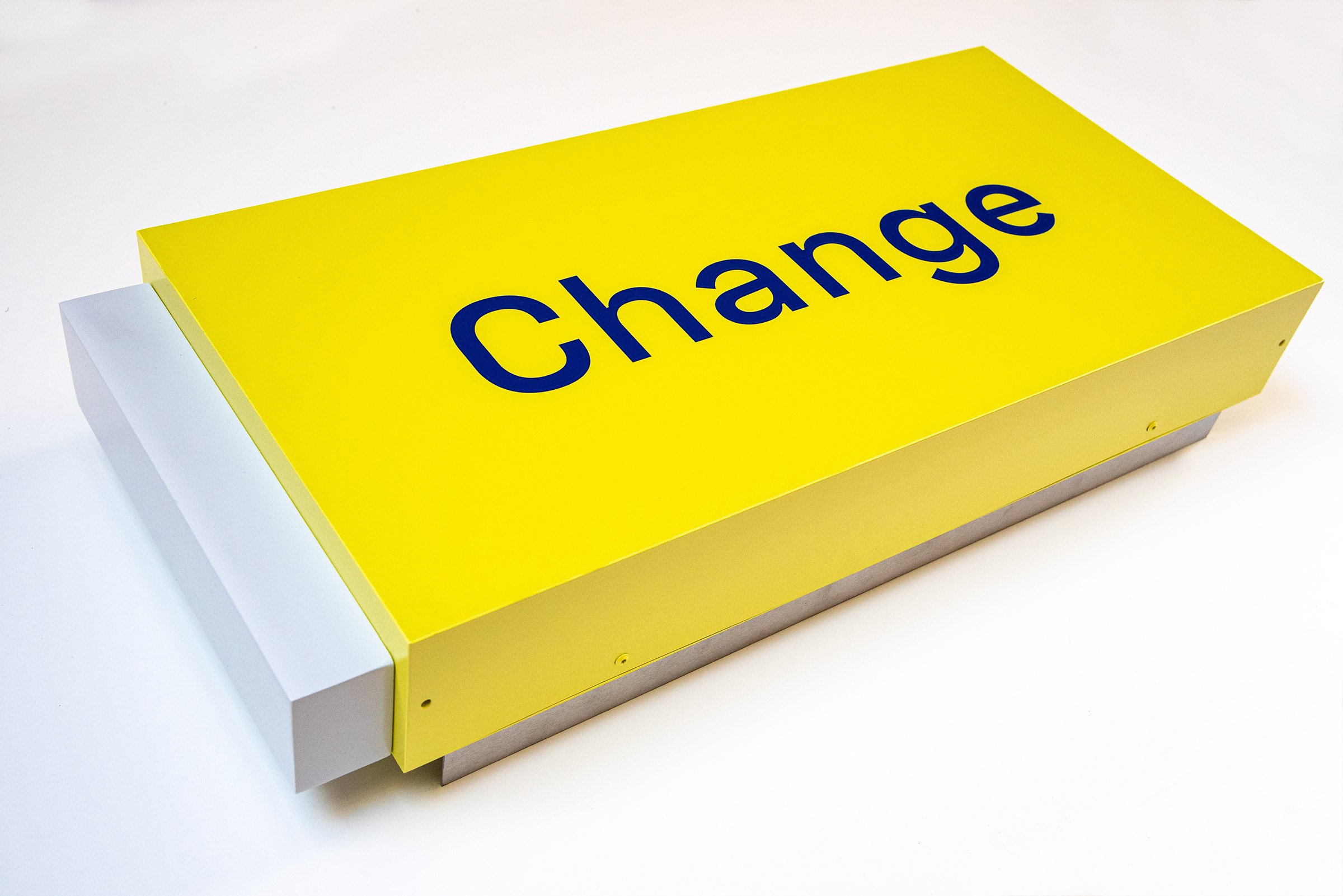
The design redesign of the approximately 100 branches and offices was completely revised after the corporate design elements were defined. Reisebank branches are characterized in particular by their very central but varying locations at train stations, airports or in city centers. The branch guide was developed with great flexibility, so that the branch design can be scaled and adapted to all structural conditions. A few distinctive modules create a high degree of recognition and enable a standardized, economical modular system. Bright rooms, clear zoning, high-quality and robust materials together with deliberately used wooden panels create a new store experience - approachable, friendly and clean.
In the context of ongoing automation, ATMs were planned as "small branches" that further boost brand awareness in train stations, airports or city centers. The cohesive and clear overall appearance creates new trust in Reisebank.


"Of course, the focus is on the digital brand experience. But if there's one bank where branches still make sense today, it's Reisebank.
Because exchanging currencies, buying precious metals, and withdrawing cash are all best done on-site at a centrally located branch. These are strong reasons for a physical, deliberately designed customer experience."
Brand Management & Implementation
Cost and implementation efficiency via consistent modularity
When implementing all media, a special focus was placed on achieving a high level of cost and implementation efficiency via consistent modularity. The visuals of the Reisebank brand and the three business segments Travel Money, Precious Metals and Cash Services are based on a standardized modular system and can be tailored to address specific target groups and be used across all media. In the strategic rollout planning that accompanied the project, the media implementations were rigorously simplified, reduced in number, and standardized. There are also customized templates for all print media which, among other things, automatically generate the characteristic headline design.
The branch design concept also follows the consistent standardization through hierarchized equipment modules that can be adapted to different room sizes, environmental situations, technical conditions and cost constraints.







Result
Long-term uplift of the offering through strategic brand change
Although the full implementation of the new brand identity is a process that will take several years, it is already evident how the sharpened brand identity contributes to more clarity and an enhanced value of the Reisebank offering.
Together with the strategic focus on three complementary business areas - Travel Money, Precious Metals and Cash Services - Reisebank presents itself as a modern financial services provider and promises a new and accessible customer experience.
The modularity of the three business areas - within a consistent brand family - also creates the necessary scalability and efficiency in brand management.
As a trustworthy point of contact and companion for mobile people, Reisebank now presents itself across the board with what is probably one of the most modern visual identities in the German banking landscape.

Kion Group
From forklift holding to
material handling masterbrand.